

6 things to learn from the past massive UX mistakes
According to research, companies that invest in solid User Experiences see a lower cost of client acquisition, decreased support cost, and increased market share. We can learn a lot from past mistakes and inculcate persistent critical scrutiny. Although technology has been advancing every minute, history helps us understand the many reasons why people behave the way they do. This understanding can help us become more compassionate and impartial.
Here’s a list of businesses and organizations that suffered the poor UX/UI design decisions, and what we can learn from them:
1. Make sure your foundation is strong and scalable for the future —
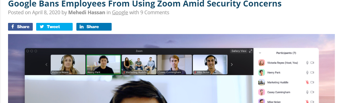
Flawed structural workflows for users — Zoom — Video and Audio calling App
Presently, when most of the world is in quarantine, the popularity of video calling applications has increased than ever. Rapid popularity got more eyeballs and hands on the app for $0. This sudden demand raised privacy concerns among the users with Zoom’s current security practices and the way the workflows are designed.
Currently, while joining a call on Zoom through the link received on your email, you tap on the link, it opens the browser, but it’s hard to understand how to open the video through the app if you’ve installed the app. It just gets confusing unless you tied your specific email calendar to the Zoom app.
Source: thurrott.com — shorturl.at/fBHJ3
This openness in their cloud also gave birth to vulnerability and Video bombing where unexpected users would drop by to create a nuisance. The other privacy issues include sharing user data with Facebook, misinformation on end-to-end encryption, and tracking of meeting attendees.
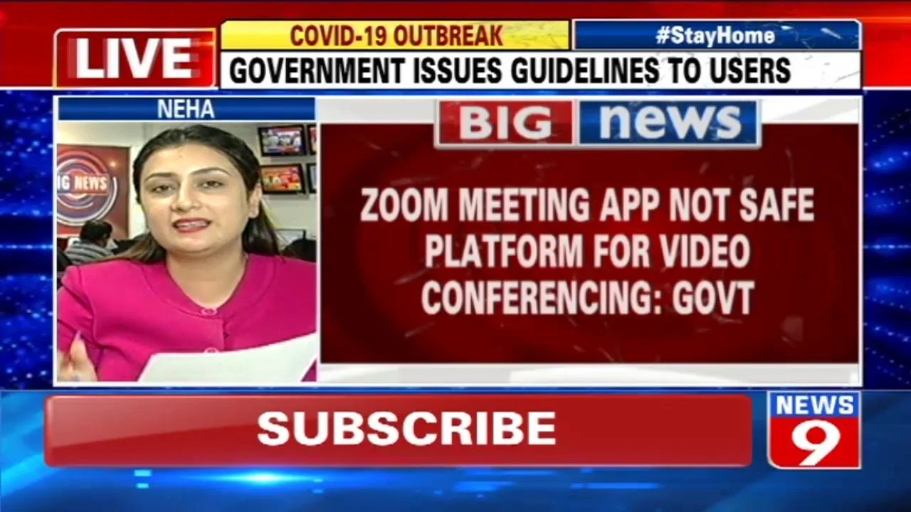
Although people continued using the Zoom app, many corporate and government organizations are not on Zoom. The most widely used apps by organizations are Webex, GoToMeeting, MS Skype, and MS Teams which have limited features but are considered way more secure.
2. It’s okay to copy but make it work for your target users and product core —
Features’ scope creep & missed opportunity — Skype’s struggle and end
In 2011, Microsoft bought Skype for $8.56 billion in cash for its state-of-the-art software built having good VoIP quality. While Zoom’s amazing success because of a pandemic should have been a story of Microsoft’s Skype, their struggle to get new and sustain existing users goes decades back.
When Skype launched a new version of the app in 2017, many users wondered if Microsoft even listens to the users. The App (Mobile & Desktop) appeared confusing and tried hard copying Snapchat, WhatsApp, and Telegram. Instead of new downloads, this frustrated the existing users due to mere adding inconvenience by removing and introducing unwanted features. Following are some of the features mentioned in the user reviews that made this release unexceptionally sour:
· Flexibility to show your profile as available or invisible
· Customize text formatting and large animated emojis
· Unable to see online and offline friends, unless you open their chatbox
· Limitation on sharing images/videos from your phone (can only share from the gallery folder)
and the list goes on…
Considering the scope and competition, Microsoft can still absorb more market share for Video & Audio calls. Therefore, they have been strengthening their Teams app and have decided to sunset Skype by 2021.
What can be done next?
· Meticulously plan the dismissal of the app and facilitate easy migration to Teams app
· Resolve usability issues on Teams before migrating Skype users
· Find which skype features are working and preferred by the users, and test them on Teams
3. Give users flexibility and control on actions and over their own data
My way or no way, Users said “Our way!” — Privacy update on WhatsApp
A lot of people were critical and worried when Facebook acquired Whatsapp. Facebook has been a prime example of a company that isn’t worried about the users and their privacy. The progress has been very slow and confusing for the users which has made a lot of users uncomfortable, and they have either dropped or reduced the use of Facebook.
This year in January. when WhatsApp abruptly announced the privacy update and mentioned that the users will be forced to abide if they don’t accept the terms. There was a massive outcry on social media and millions of users switched to WhatsApp alternatives. The drop in users was clearly seen after the first 3 weeks, as the Signal app gained 7.5 million new users and Telegram grabbed 25 million globally.
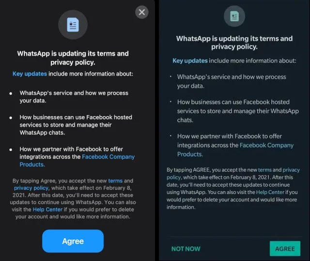
Privacy update announcement in January 2021
I have been using WhatsApp for many years and still using it, I feel WhatsApp does a good job in terms of privacy and provided flexible security options to the users. This privacy policy is related to the individuals who engage in conversations with business accounts which literally doesn’t even affect individuals messaging each other. But the way the notifications appear for the users and the mention of businesses and Facebook using user data, really freaked out the users.
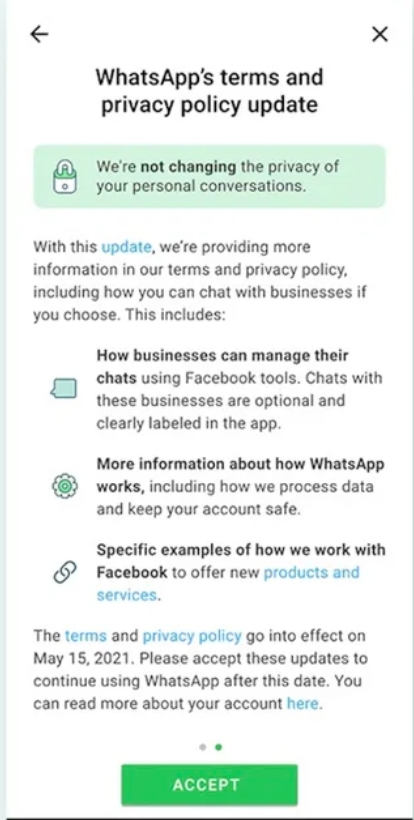
The later updates explaining privacy via WhatsApp’s story feature
4. Never ignore the 9th and 10th criteria from the Heuristic Evaluation set –
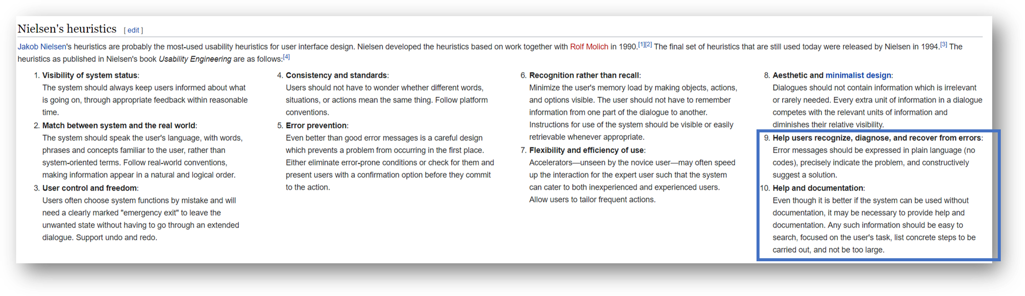
Neilsen Norman’s set of 10 Heuristic Evaluation. Source: Wikipedia
On August 11, 2020, the confusing interface of financial software — Flexcube sent out $500 million to the creditors which weren’t due until 2023.
To prevent paying the principal to the creditors, the user was supposed to set the “front” and “fund” fields to the wash account as well as “principal”. As you can see in the below UI there is no help or error prevention mechanism set for such a huge transaction.

Source: ARS Technica — shorturl.at/fqQT4
This task was assigned to a subcontractor from India who THOUGHT that checking the “principal” checkbox and entering the number of a Citibank wash account would ensure that the principal payment would stay at Citibank. The procedures at Citibank require three people to sign off on a transaction of this size. The party of 3 here included the subcontractor, his colleague in India, and a senior Citibank official in Delaware. All three believed that they are processing it correctly and the system also didn’t throw any errors or roadblocks. After the Delaware supervisor approved the transaction which accidentally paid back the principal on the entire loan instead of interest payments totaling $7.8 million to these creditors.
The least they could have done is conducting a heuristic evaluation of the system. End-to-end testing with test data in the sandbox is a must before you launch such expensive tools for offshore employees.
5. Don’t make assumptions for new users.
Prepare and design a persona and see how the persona would behave in a mission-critical situation (do risk mitigation).
The Integrated Bridge and Navigation System, or IBNS
IBNS, what the Navy considered a triumph of technology and thrift was one of the reasons for the USS John S. McCain Ship’s disaster and 10 casualties (and a few injuries). The Navigation System is slick black touch screens to operate the ship’s wheel and propellers which knit together information from radars and digital maps. The technicians replaced the ship’s traditional steering controls a year earlier. This advanced system was also a replacement for humans who were employed to safely steer the ship.
One of the officers mentioned that it longer time to understand and read through the array of dials, arrows, and data that filled the touch screen.
“There was actually a lot of functions on there that I had no clue what on earth they did,”

Source: ProPublica (Their Source: National Transportation Safety Board report)
Clearly, the officers were not fully familiar with the system’s potential, and the system itself didn’t offer any help. My first thought when I read this story was — why there was no reboot or total stop button that can be used in emergency situations to fully stop and switch to manual.
ProPublica investigated this side of the story.
The Fire Warning System at Notre Dame, Paris
This system was meticulously designed by experts for 6 years to fully enable it. This system was connected to multiple smoke detecting sensors installed across the vicinity.
One of the major drawbacks of the system and the core function — to ‘warn fire’ was so obscure that it would generate a nearly indecipherable message. On triggering the fire warning the system displayed more than needed information.

The fire first started in the attic of Notre Dame, Paris. Source: NY Times article
The complex warning message comprised of
· shorthand description of a zone — the cathedral complex was divided into four — that read “Attic Nave Sacristy.”
· code for one specific smoke detector among the more than 160 detectors and manual alarms in the complex. Eg: ZDA-110–3–15–1
· Name of the aspirating detector — like “aspirating framework,”
I am still confused and couldn’t fully understand the above warning. I feel for the employee who was monitoring this system. As it took almost took 23 minutes before the staff could figure out where the fire was and alert the right people to control the hazard.
The added fuel to the fire was a newly hired security employee who merely started 3 days back. So, the employee was still getting trained but was handed over a complicated and critical task.
I visited Notre-Dame, Paris in 2017 and was awestruck with its beauty and majesty. I was shocked when I heard the burning news. A few things that could have made the Fire Warning System better:
· Dissolve erroneous assumptions on new users
· Provide new users with contextual hints
· The system should have automatically alerted the first responders within 2 mins of no action taken
· The system should have the ability to show the next steps or actions that the user can take. Also, record the user’s actions in the system
· Lastly, the cryptic textual messaging could have been replaced by a simple 2D/3D map of the cathedral showing which sensor data point has been triggered because of smoke detection
· Even text — ‘There’s a fire in the attic, RUN!’ would have created a greater sense of urgency
Read this piece by NY Times, they did an amazing job explaining the fiasco.
Here is another sad story I found on Medium.com of a young girl battling cancer who died early because 3 nurses couldn’t figure out the Digital Health tracking and monitoring dashboard.
6. Validate your solution to ensure you’re delivering a workable shopping experience by first deploying it at a smaller scale
(Shadow and observe the users)
Findings from Walmart’s 2009 survey led to an insight that shoppers wanted less clutter in the stores. On a similar shopping, layout Target was raking sales at their stores. Therefore, Walmart decided to implement the users’ feedback by adding a team (added manpower = $$$) to reduce the inventory on the floor.
They already lost $1.85 million after the store remodeling in 2008, and this 2009 project decreased the inventory in stores by 15%. This move backfired them immediately by a drop in the same-store sale closing which accounted for a loss of $2 billion. The team worked on it was fired and they went back to adding the inventory and reorganizing the clutter. The most expensive lesson a retailer could learn by ignoring customer focus.

Walmart store actual photograph. Source: Walmart.com
I am a huge fan of Spotify and here is a story on how they conducted A/B testing to find out if the hamburger menu should stay or leave on their mobile app.
While a poorly designed UI makes it difficult for users to use the digital applications, a poorly designed UX makes users confused and destroys the designer’s creativity. Shipping out an MVP to just tick off that checklist on your definition of done with such complexity will create a sense of frustration and buildup anger for the existing as well potential customers. This also leads to a drop in revenue, productivity, consumer retention rate, and ROI on development. Application failure reasons can differ, but negligence in UX and UI can surely hamper your product’s success.
As a Designer or Owner of the product, it is essential to understand the importance of User Experience for digital applications that add worth to the user’s experience. There are various ways to measure user’s experience and satisfaction. However, it is suggested to explore the unhappy path along with the happy path on the user flows during the app development process.
Thank you for your time! 😊🙌